It is best to use the micro-themes for styling.
Other
If you select flows, forms, reveals, tabs, accordions, and etc., using the Other micro-theme will allow you to edit the animation, styling of these overall components.

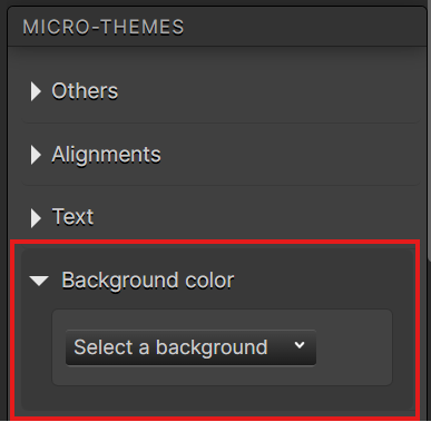
Background color
Applying brand guideline colors to containers, regions, and etc.

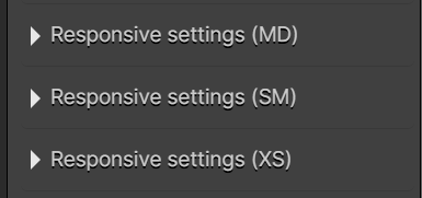
Responsive settings (MD), (SM) & (XS)
These are where settings can be altered for mobile landscape and portrait viewport. Ex. If you add margin/padding for your desktop experience but would like it removed in mobile, using the Responsive settings, you can checkmark ‘no margins’ to remove the space.

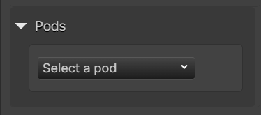
Pods
Pods are containers with spacing and color backgrounds. This can be applied to containers to give spacing and backgrounds reflecting your brand.

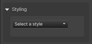
Styling
Styling will have rounded borders, color borders, shadows that follow your brand guidelines.
*There may be other micro-themes that appear based on the components you select. Ex. If you select a choice or a choice group, styling, etc. will appear for additional choice edits.

Regions & Pods
It is more efficient to apply container colours via the region and pods micro-theme because the content within the containers will adjust its colour styling rather than applying a background colour. Background colours should only be applied if the pod or region colour isn’t available. If the pod or region colour isn’t available, there is a transparent dropdown option in both the region and pods micro-theme to still set the default spacing.
In general Regions are used for sections and pods are used for small components such as resources. Ex. If a peppercorn region or pod is applied to container, the elements within the container will change colour to white for readability and accessibility. If you a background color is applied instead, the content will remain its default color.
