A really helpful feature in ION, is the ability to add on custom CSS to elements and combining them with media queries. We found this to be very helpful in creating custom creatives.
In many instances, changing a simple setting – like padding or a border between screen sizes -requires the element to be duplicated and then hidden/show on each screen size.
By using some custom CSS and a media query, we can style specific elements on specific screensizes. Which allows us to only use one element across the 4 screen sizes.
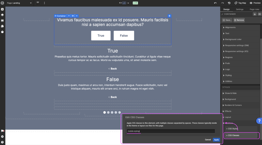
Step 1: Assign a custom CSS class to an element
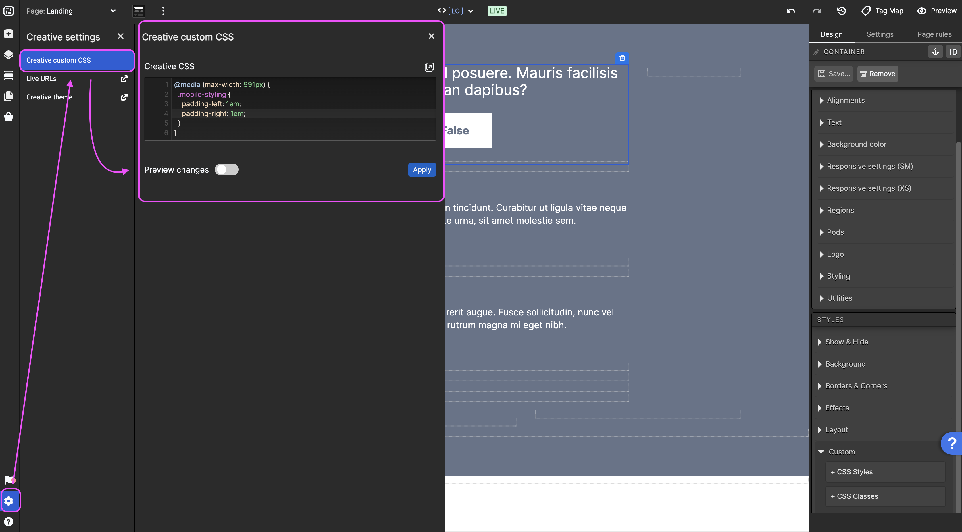
Step 2: Write CSS and media queries, associated with the custom class
We found that you need to put !important at the close of each property, to overide the ION generated styles.
If you have any questions, please contact us on [email protected].

