This engaging and resourceful landing page template breaks down large content into different visual displays. In the hero section of the Healthcare Landing Page, you will notice micro-animations, information displayed in a flow, and a Lead Gen capturing opportunity through the form. As visitors scroll through the experience, they will notice additional resources for speciality health care, odometer counters, reveals that change color on hover, flow navigation with icons displaying additional content and a google imported map. Visitors are encouraged to navigate this experience and discover different ways content can be displayed.
- Type: Landing Page
- Complexity: Medium
- Use case: Lead Generation
Features available
Here are the major features, abilities, and interactive elements used in this template.
- Additional Flow Steps
- Animation
- Flow Progress Bar
- Form Inputs
- Odometer Values
How-to use
Here is a helpful guide on how to handle all the major features, abilities, and interactive elements available to make the most out of this template.
Additional Flow Steps
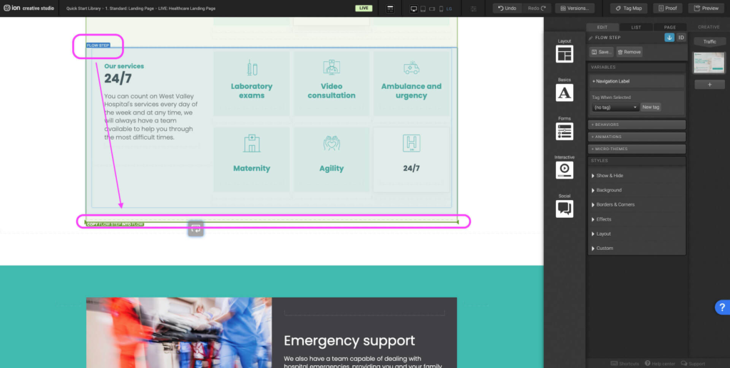
Step 1: Select the last flow step within the Flow. Hold the alt key on windows or options on mac and drag the flow step until the Flow highlights green. The bold green bottom border on the flow indicates that it will duplicate into the Flow. You can alternatively select the flow step, press Ctrl+C or Command+C then navigate to the flow and press Ctrl+V or Command+V.
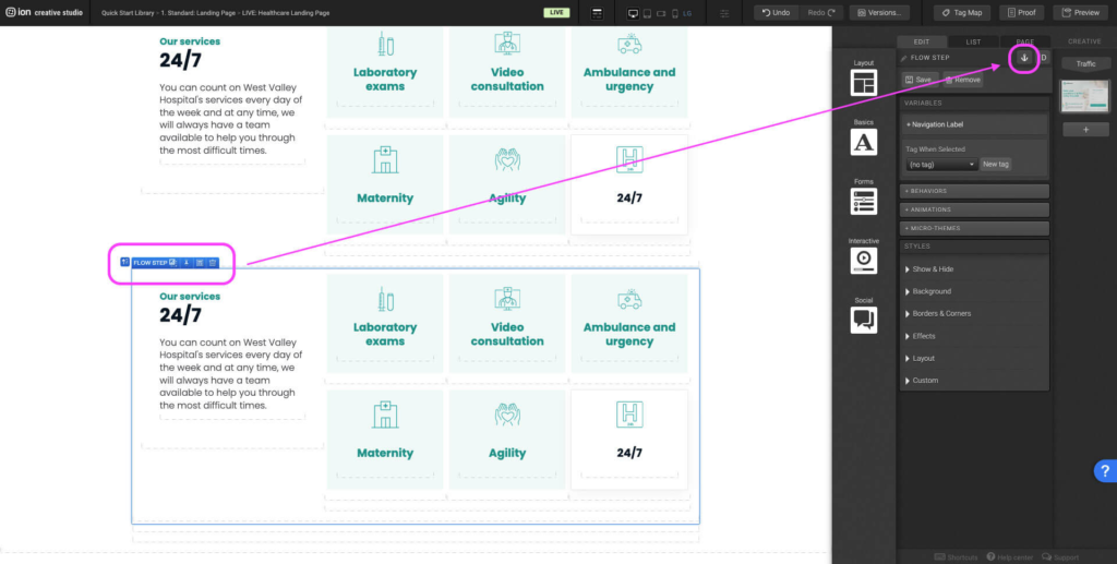
Step 2: Select the newly added flow step. Navigate to the right hand side panel. In the top right corner there is an anchor symbol. Add an anchor. An anchor allows users to be sent to a specific point on the page when a Scroll to behavior is added targeting the anchor.
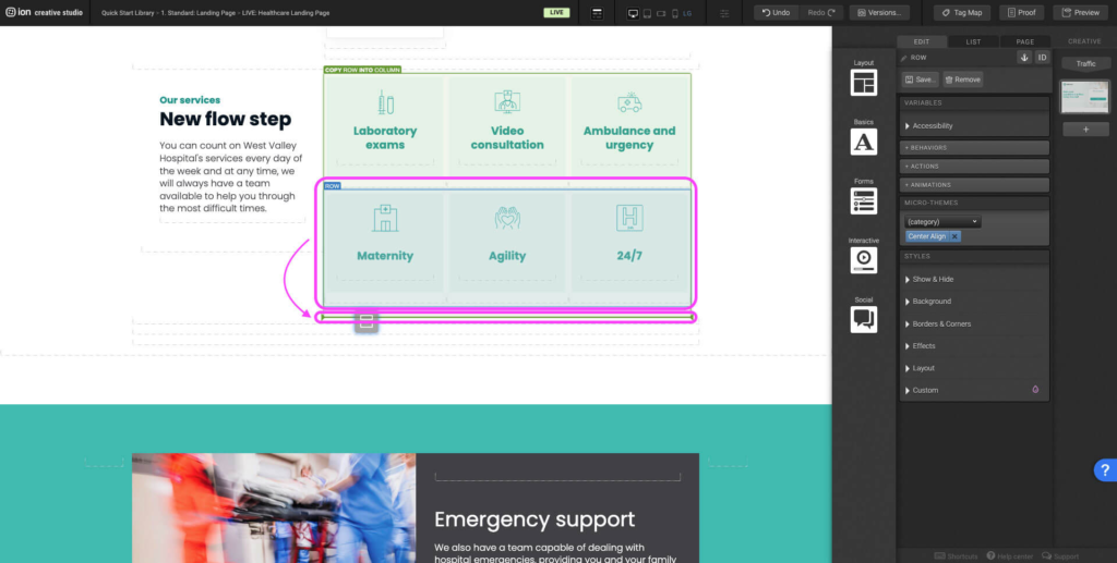
Step 3: Follow Step 1 and duplicate the row with the selected state adding a new row to the column.
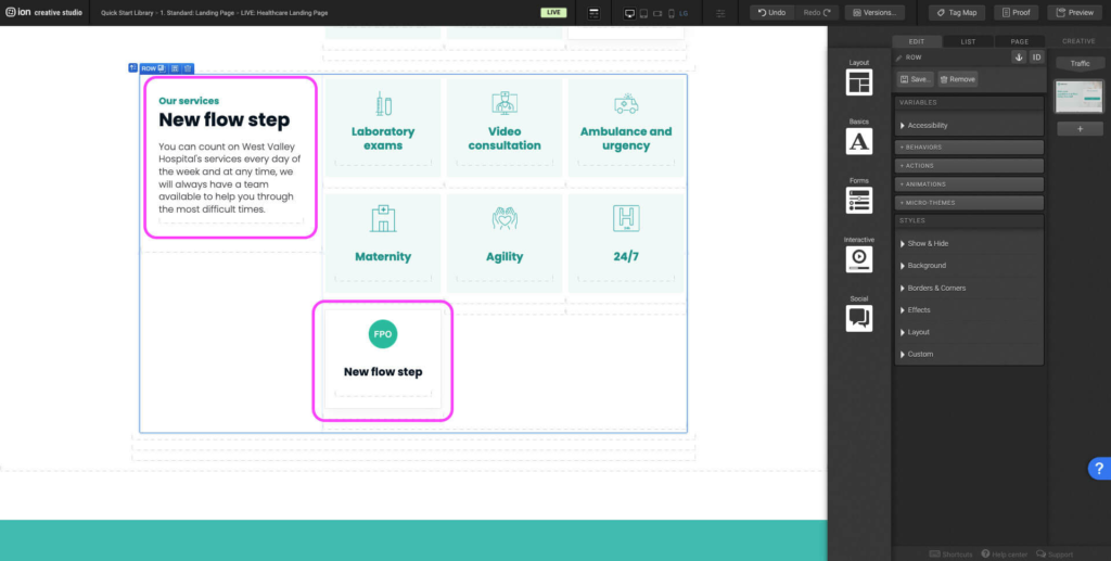
Step 4: Adjust the layout for the new row. Remove duplicated containers that aren’t needed, change copy, and update the image icon. Note that you will want to adjust the image size to match the rest of the navigation icons.
Step 5: Select the new flow step navigation container within the column. Navigate to the Behaviors panel, update the Scroll To anchor point in the dropdown selecting the name of the new flow. Don’t forget to update the tag as well.
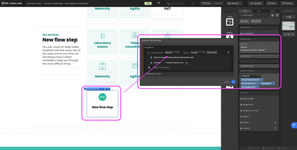
Step 6: The new flow step is now complete. Now navigate to all previous flow steps and update the navigation adding the new flow step navigation following Steps 3 & 4. Use the Micro-Themes to redesign the style of unselected state to match all other unselected navigations.
Animation
Step 1: Select the element on the page where you would like to apply or change the animation. Navigate to the Animation panel, select the trigger (immediate, hover, scroll always, etc.) and then select the type of animation.
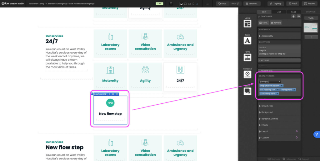
Flow Progress Bar
Step 1: To change the placement of the Flow progress bar either left, right, top or bottom select the Flow container and navigate to the Micro-Themes. Under the Micro-Themes dropdown select Flow, under the second dropdown select either Navigation Alignment: Left, Right, Top, or Bottom.
Step 2: To change the Flow style from number to dots or a progress bar in light or dark select the Flow container and navigate to the Micro-Themes. Under the Micro-Themes dropdown select Flow, under the second dropdown select from the different Navigation Styles available.
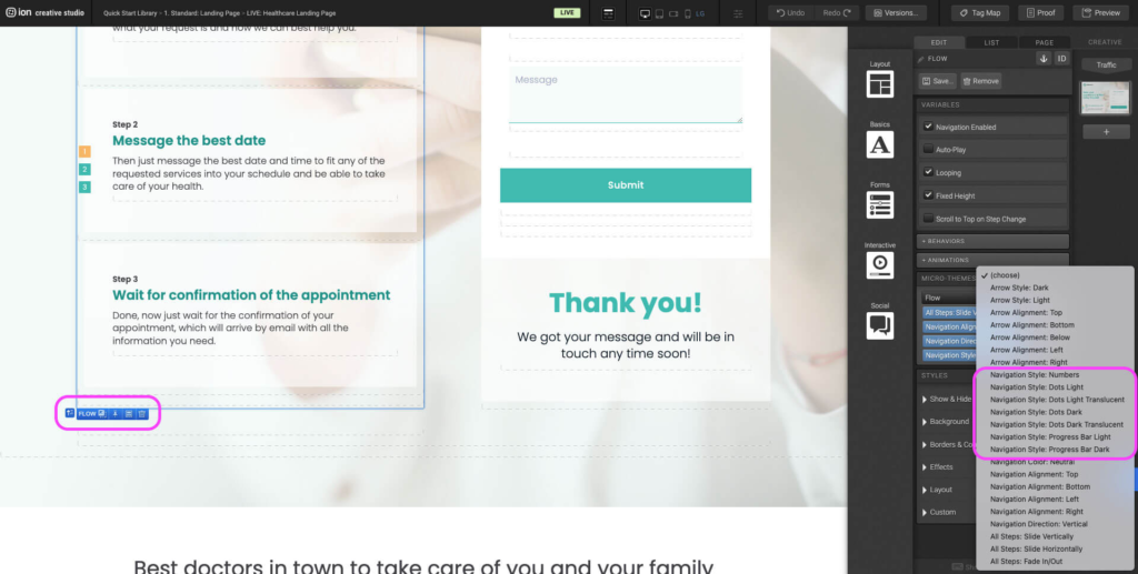
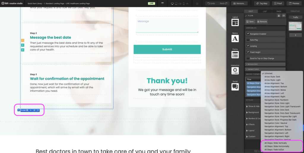
Step 3: To change the direction of the flowsteps sliding in and out select the Flow container and navigate to the Micro-Themes. Under the Micro-Themes dropdown select Flow, under the second dropdown select from the All Step options.
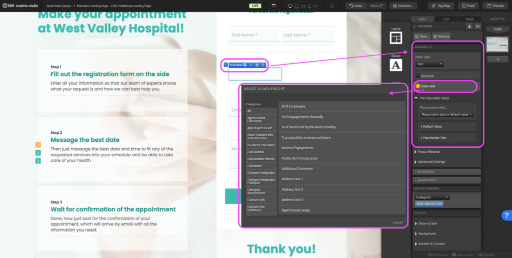
Form Inputs
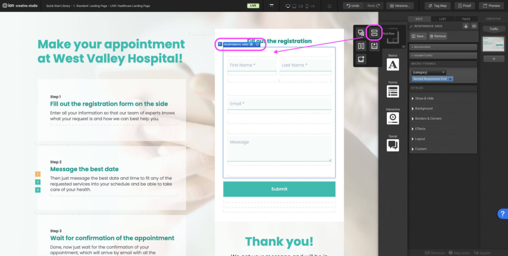
Step 1: Start by adding a Row element into the Responsive Grid within the form.
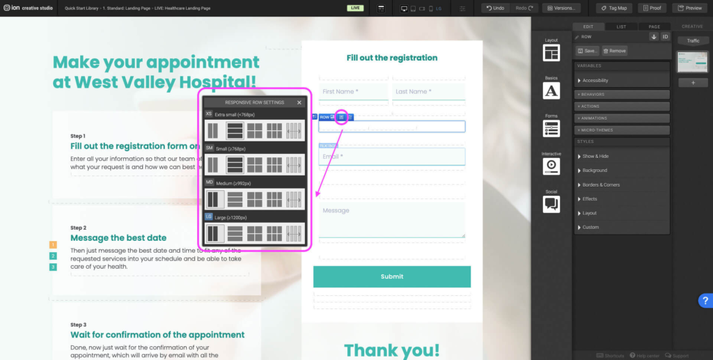
Step 2: If only one new form input is being added then you will probably want to remove two of the default columns that come with a new row and adjust the row settings so that the column spans the entire width of the row. If there are two new form inputs then remove one of the default columns and adjust the row settings. Alternatively you can hover each end of the column and drag left or right to change the width.
Step 3: Using the interactive Form elements, drag the desired input type (slider, text input, dropdown etc.) into the new column.
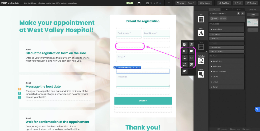
Step 4: Remove the label text. Select the input within the new Form Field and navigate to the Variable panel. Update the input type (text, email, phone number, etc.), set to required if necessary, add a data field, and placeholder text.
Odometer Values
Step 1: To change the odometer counter to a different value, select any of the current odometer Text containers. Open the Text Editor.
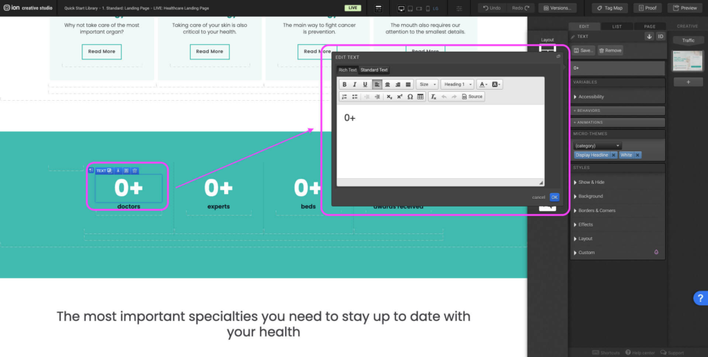
Step 2: On the open left of the Text Editor select Standard Text. Update the data-prev and the data-val value. Data-prev refers to the starting value and the data-val refers to the end value. If you change the Data-prev value to a value other than 0, update the display value as well.
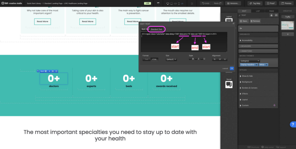
Step 3: If you want to display next before the counter add the text before the <span>. If you want to display text after the odometer add the text after the </span>.

Content Writing Template
Here is the content structure’s template to make it easier for you when providing content guidelines or creating the copy for this template, from understanding the content structure to getting to know the amount of words needed to each text piece.
Related templates
If you like this template, you might want to check out these other similar models.
Have a question?
Still have questions or are facing troubles when handling this template? Please do not hesitate to send any additional questions to [email protected], so we can make sure to have this article constantly up to date.