If you’re already familiar with CSS or interested in learning, you’ll be happy to know that Ion fully supports adding your own custom CSS to your creatives. Of course, you have the ability to modify your theme’s CSS; but, if you are just looking to add a simple one time class or inline styling to one of your elements, adding CSS directly to your creative might be the way to go.
Where to add CSS in Creative Studio:
This allows you to quickly alter the styling of any elements on your page without adjusting the actual theme code. You can even add your own micro-themes here! This is great for style updates that you want to make to a specific page or creative but not to all creatives using that theme. You will even be able to see your CSS changes directly on your page while editing!
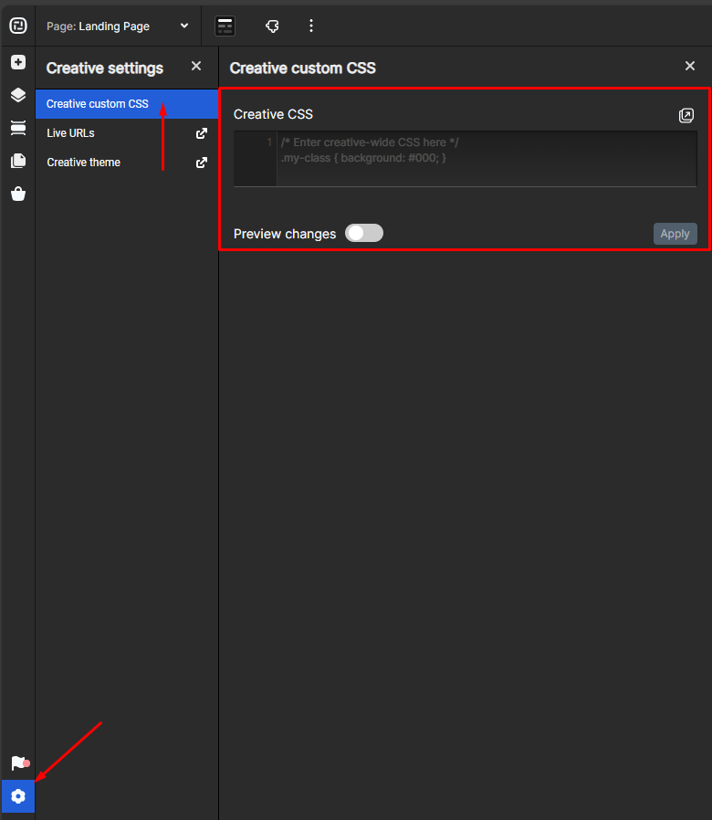
To edit the creative CSS, go to the gear icon on your bottom left, then creative custom CSS.
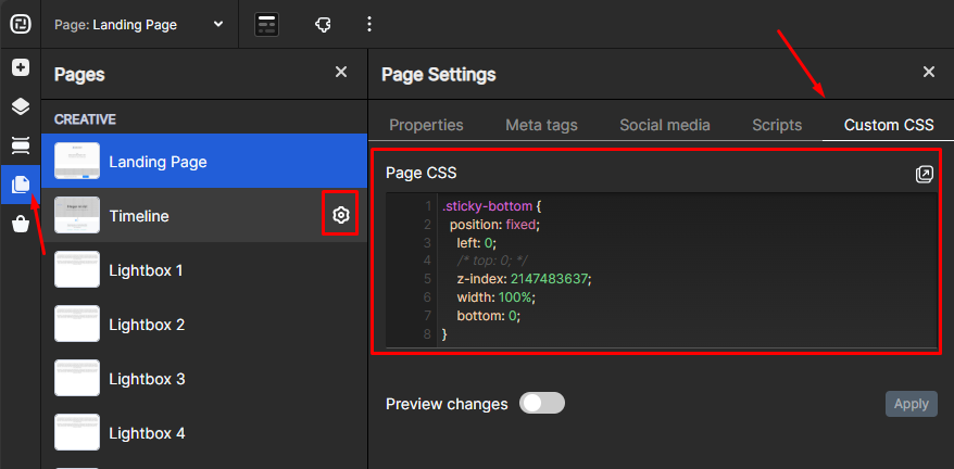
To edit the page CSS, go to creative pages on your left pannel and click on the gear icon that will appear next to the page and then custom CSS.
Creative CSS
Creative CSS styling will be applied across all pages within your creative. If you edit this on one page within your creative, it will apply immediately to all other pages.
Creative CSS is useful when you have an element that may not need to be a part of your theme. For example, a button color change that you don’t want to be applied to any other creatives, but want to use in this creative.
You can also utilize the ion platform-specific tags to define a micro-theme that is only available on that Creative or Page. Once you save, a page refresh will occur and you will be able to instantly utilize the new micro-theme.
Page CSS
Page CSS will only apply to the current page you are in in your creative. If you make edits to the Page CSS, it will only be saved and applied to that page.
Page CSS is helpful to apply page-specific CSS like changing the height of an element that appears on each page.
Media Queries
Another great use case for Creative and Page CSS is to change styling using a CSS media query for different viewports instead of showing and hiding multiple versions of a given element.
For example, there might be times when you want to make <h1> headlines a different size in the XS viewport without showing and hiding different versions of that headline. A media query can be added to the Creative or Page CSS editor to change the size for the XS viewport (767 px wide and smaller). Below, please find an example of a media query that can be used to make <h1> headlines 1.2 em in the XS viewport:
@media screen and (max-width: 767px) {
h1 {font-size: 1.2em;}
}
Here is a set up of media queries based on the 4 defined sizes in the ion platform of Large, Medium, Small, and Extra-Small:
/*MEDIUM SCREENS*/
@media screen and (max-width: 1199px) {
}
/*SMALL SCREENS*/
@media screen and (max-width: 991px) {
}
/*EXTRA SMALL SCREENS*/
@media screen and (max-width: 767px) {
}
Adding Classes and Inline Styles to an Element on the Page
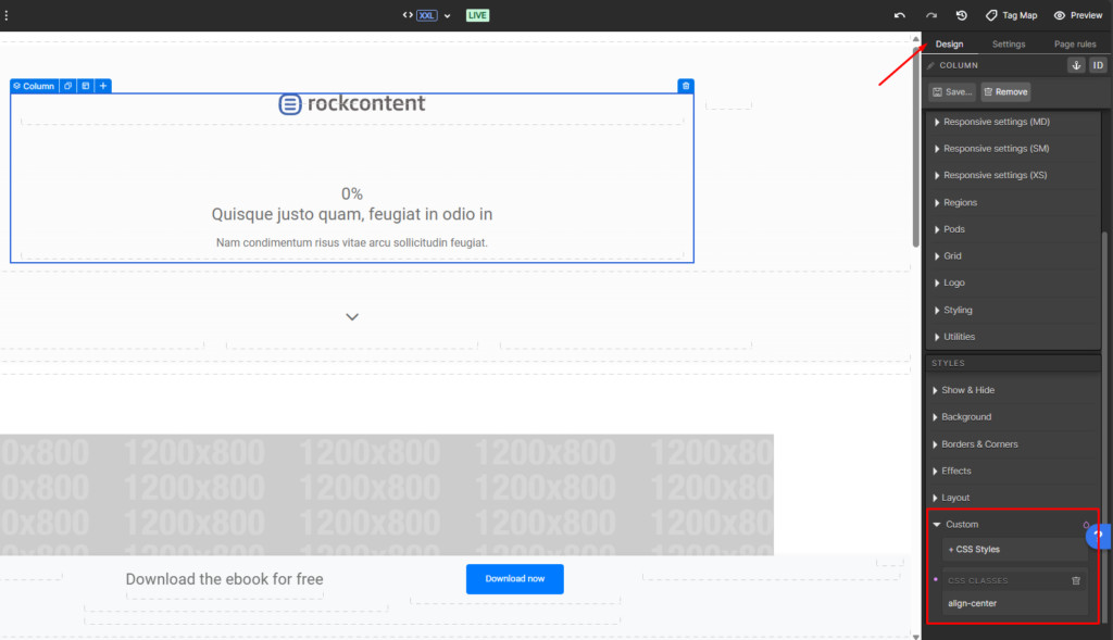
Once you’ve written some classes for the page and/or creative, you can apply them to specific elements. To do this, you’ll want to select the element on the canvas, then locate the “Custom” dropdown at the bottom of the design panel. Here you can add CSS Classes that you’ve written in the page tab to your elements or you can write inline styles for the element.
Modifying Ion CSS Classes (Examples)
Hamburger Menu
You might be interested in modifying classes that have already been written into Ion or your theme for a specific case. To do this, you’ll have to identify the name of the class and overwrite it. We can find the name of the class using Chrome’s (or any other browser) inspect tool. In this case we will be looking to modify the color of the hamburger menu so we need to find out the class that is causing our hamburger menu to be white.
First, we open up the preview of our creative, locate the element, right click, and inspect. After clicking to inspect the element, we’ll see the HTML and CSS for the page pop up.
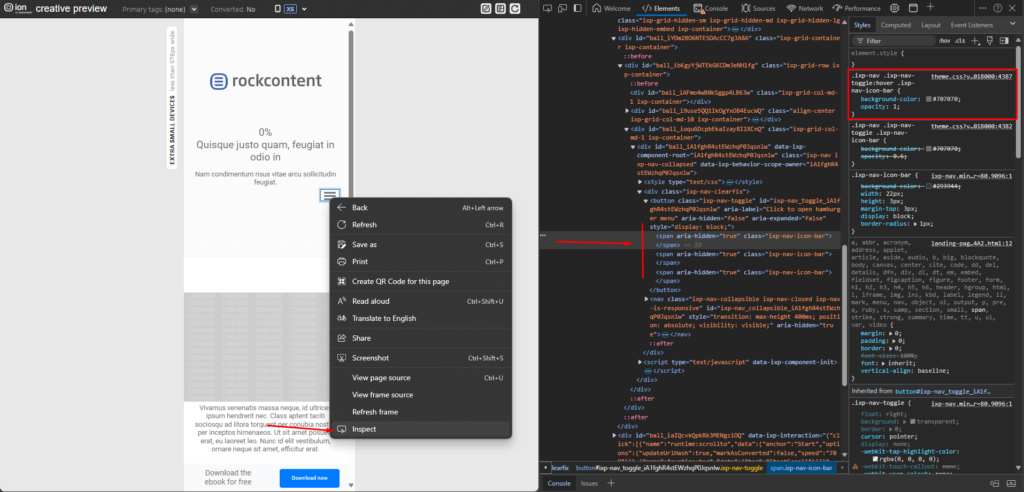
In this example, we can see that the class applied to this element is “.ixp-nav .ixp-nav-toggle .ixp-nav-icon-bar”. We can even test this within Chrome’s inspect tool by changing the background color and seeing if it modifies the actual page.
Once we have the name of the class we can go back to Creative Studio and modify it in the page or creative CSS. In this case, we want the hamburger menu to change creative-wide.
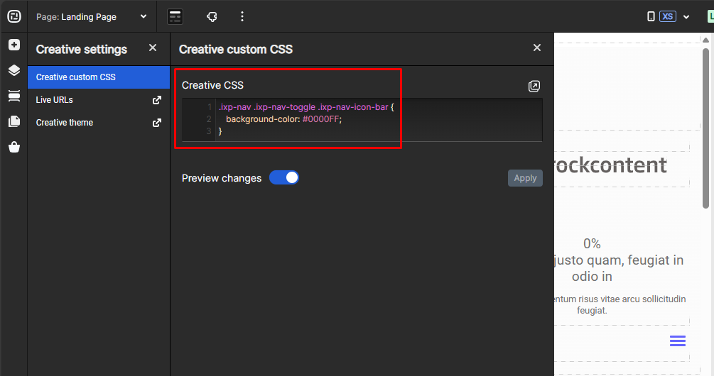
Immediately we see the color of the hamburger menu change!
Buttons
Your theme comes with many button presets; but you might find yourself in a situation where you want to modify the buttons on your page. You could do this using inline styling if it’s only one button or you could change all of the buttons creative wide in the Creative CSS editor under the page tab.
To do this, go to the page tab and select the button. Under custom in the edit panel, you’ll see a few CSS classes added to the button. In our case we’ll adjust button-a in order to change all the buttons on the page with that class. If we wanted to change only the large buttons, we could alter button-large.

Once you’ve found the button class name, you can go to the page panel and edit the creative or page CSS. We modify the button-a class by typing:
.button-a {
   /* styles to change */
  background-color: red;
  border-color: red;
  border-radius: 25px;
  color: white;
}
In our example, we’ll change the background color and border. Additionally, we might want to change the hover color for our button. We can do this by typing:
.button-a:hover {
  /* styles to change */
  background-color: maroon;
  border-color: maroon;
  border-radius: 25px;
  color: grey;
}
Here we can specify what the button should look like when the user hovers over it.
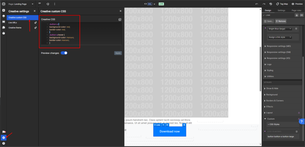
You should see the change take effect in Creative Studio after hitting OK.
Placeholder Text in Forms
To change your placeholder text on a form, you’ll want to add the following to your creative or page CSS.
.ixp-component-form-style-brand-brand .ixp-component-dropdown-inherit .select2-default .select2-chosen {
   color: #222;
}

.ixp-component-form-style-brand-brand .ixp-component-textbox-inherit .ixp-component-textbox-input:-moz-placeholder {
   color: #222;
}

.ixp-component-form-style-brand-brand .ixp-component-textbox-inherit .ixp-component-textbox-input::-moz-placeholder {
   color: #222;
}

.ixp-component-form-style-brand-brand .ixp-component-textbox-inherit .ixp-component-textbox-input::-webkit-input-placeholder {
   color: #222;
}

.ixp-component-form-style-brand-brand .ixp-component-textbox-inherit .ixp-component-textbox-input:-ms-input-placeholder {
   color: #222;
}

.ixp-component-form-style-brand-brand .ixp-component-textbox-inherit .ixp-component-textbox-input::input-placeholder {
   color: #222;
}
If you have any questions, please contact us on [email protected].