As part of your ion console setup, we will code one branded theme that can be applied to your ion experiences. Your theme includes brand-approved styling that controls the look and feel of your creative. For example, when you apply your theme to a Quick Start creative, the fonts for that creative will be updated to use your brand-approved fonts, buttons will take on brand-approved colors and your logo will appear in the top left corner of the page.
Before editing any creative you download from the Quick Start Cloud, you will want to apply your branded theme to the creative to ensure that it utilizes brand-approved styling that are loaded into your theme. After downloading a Quick Start, you can quickly change the theme by selecting your branded theme from the theme dropdown menu on your creative management screen.

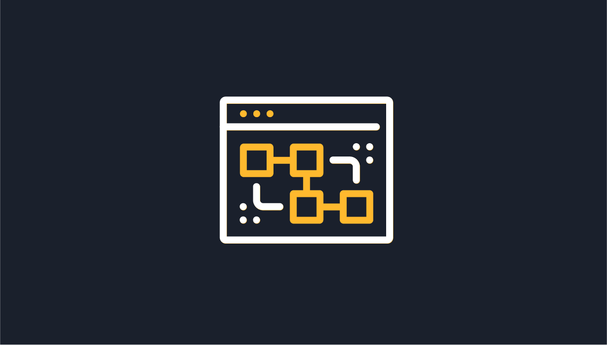
Micro-Themes
Your ion theme comes with tons of micro-themes that allow you to quickly change the style of the content on your page.
By using Micro-Themes, you will be able to create hundreds of on-brand page style combinations using a single theme that is based off of your site’s brand guidelines!
Micro-Themes are content-specific. So, if you’re editing a link, you’ll see Micro-Themes that are specific to styling links. But if you’re editing text, you’ll see Micro-Themes that are specific to styling text.
When editing a container, you can use Micro-Themes to apply variations of styling options built into your theme. This gives you the ultimate control over how your page is styled within the safe and consistent standards built into your branded theme. For instance, you can style any group of links as either your main navigation tabs or as footer links. You can also apply different color and style schemes to your content pods, forms, and other page elements, to create an alternate, on-brand look and feel to your page.
Simply select your container and then click into the Micro-Themes button within your creative studio. Next, select the style category you would like to use (i.e. navigation, pods, buttons, etc.) and then the type of styling you would like to apply to your container.
Here you can see two different Micro-Themes being applied to a container. All of the styling — text colors, background, button, etc. — are different based on the chosen Micro-Theme.

Micro-Themes can also be used for smaller style changes like turning a text link into a button link.

*NOTE: If you are working within a theme that has Micro-Themes defined but are not able to find the Micro-Theme option in your creative studio, you may have something selected for which no Micro-Themes are designed. When in doubt, find the container for your content (its row, column, responsive grid, etc.), press the up arrow on your keyboard.
Micro-Theme Categories
Branded Micro-Themes
The below micro-theme categories include options that were coded into your branded theme and are tailored to your brand standards. Additional branded micro-themes can be added to each of the below categories as needed over time.
Accordion
This category includes alternative style options that can be applied to any accordion component published into your page.
Backgrounds
Can be applied to any container, column, row or grid. When utilized, these micro-themes will change the color in the background of the element it is applied to.
Bullet List
These micro-themes can be applied to text and are used to alter the type of bullets used within a bulleted list.
Buttons
Button micro-themes can be applied to text links in order to turn them into buttons. Button micro-themes come in different shapes, sizes and colors and also include different click cues for each button type.
Color
These micro-themes can be applied to text and control the color of the text they are applied to.
Fonts
Font micro-themes can be applied to text and change the font used by that text.
Link
These micro-themes can be used to control the style of any text link published into your page.
Logo
Logo micro-themes can be applied to any container to display one of the logos coded into your theme within that container.
Pods
Pods contain CSS that affects the styling of multiple elements at once. By default, they will add padding to all sides, change the background color, the text color, the link color, and the button colors.
Regions
Regions are similar to pods; they will control top and bottom padding, background color, text colors, link colors, and button colors.
NOTE: Regions are meant to be applied to entire sections of a page, whereas Pods can be applied to containers/columns within a region to override the Region styling.
Tabs
This category includes alternative style options that can be applied to any tabbed content component published into your page.
System Micro-Themes
The below micro-theme categories include options that are available in all consoles and are not specific to specific brand standards.
Alignment
Includes left, right and center alignment options. These micro-themes can be applied directly to text or to an entire container. When applied to a container, everything within the container will align to the left, right or center.
Drop Down
Includes different style options that can be applied to drop down menus within a freestyle form.
Choice Group
Includes different style options that can be applied to a choice group within a freestyle form.
Choice
Includes different style options that can be applied to an individual choice within a freestyle form.
Flow
Flow micro-themes can be used to adjust the navigation style and color, the alignment of the Flow navigation as well as the transition effect used when going from one Flow Step to another.
Form
The micro-themes in this category can be used to control the style of your form fields, what happens within the form when validating form fields, the placement of your form labels, the alignment of the submit button and the style of your required fields. You may apply more multiple form micro-themes to any freestyle form you publish within an ion page.
Form Field
The micro-themes within this category can be applied to a form field container and can be used to change the style of the field.
Full-Page Slider
These micro-themes can be used to adjust the style/color of the navigation used within a Full-Page Slider component.
Grid Layout
The Grid Layout category includes micro-themes that can be used to make adjustments to columns and rows within a given grid. These micro-themes can be applied to the entire grid or specifically to a column or row. The options in this category include:
- Nested responsive grid – makes the responsive grid expand or contract to fill the space available within a given container.
- Gutterless columns – removes the gutters between columns so there is no longer any padding between them.
- Row padding – adds various amounts of padding to the top and bottom of a given row.
Images
This category contains options that can be applied to an image to align it to the left, right or center of a given container.
Reveal
These micro-themes can be used to apply transition effects and to adjust the overlay style.
Slider
Includes different style options that can be applied to a slider within a freestyle form.
Styling
This category includes predefined styles that can be applied to virtually any piece of content. These options included a circle/oval option (which frames your content inside of a circle/oval), a light drop shadow, a flat drop shadow, rounded corners and a dark gray border.
Text
This category contains micro-themes that can be used to style text like a caption or fine print. Caption text would normally be used below a photo as a short description and fine print would normally be used for a disclaimer.
Textbox
Includes different style options that can be applied to a textbox within a freestyle form.
Utilities
This category includes micro-themes that are used make functional adjustments to content. The micro-themes in this category can be applied to most content published into your page and include:
- Animation Wrapper – can be added to a container housing a Reveal component to correct an issue with CSS transforms in the Safari browser that negatively impacts the Reveal component’s ability to use the “flip card” micro-theme.
- Direction: Right to Left – changes the direction of text to go from right to left.
- Dynamic Visibility – when applied to an element, will not show that element on the live page but will be shown when editing; usually paired with custom code to toggle content on and off.
- Hide in IE8 and Lower – hides content in Internet Explorer 8 and earlier versions.
- Hide when Printing – can be applied to any element to hide that element when the respondent attempts to print the page.
- Insert Page Break when Printing – can be applied to any content to set a breaking point above that element when printing so that everything below that break point renders on a new page.
- Show only in IE8 and Lower – shows content in Internet Explorer 8 and earlier versions.
- Show Only when Printing – can be applied to any element to only show that element when the respondent attempts to print the page.
- Scroll Awareness (once) – can be applied to an element to trigger a custom animation the first time someone scrolls to that element.
- Scroll Awareness (always) – can be applied to an element to trigger a custom animation every time someone scrolls to that element.
- Top Most Layer – moves content to the top of the layer it is published into; used to move content to the front of other elements published in a given container.
