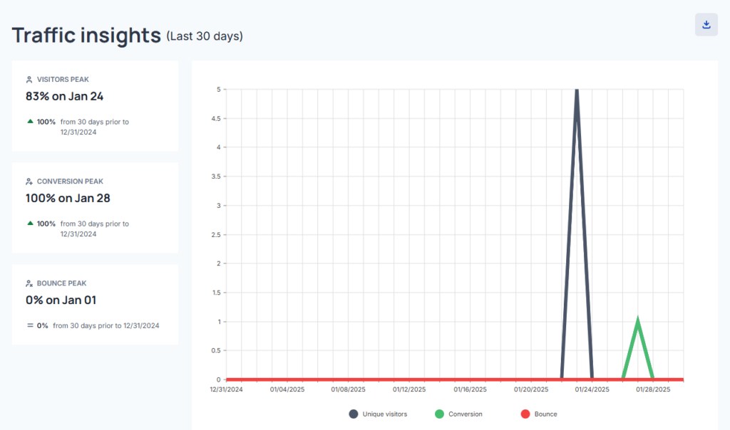
Traffic chart shows the flow of traffic over a given period of time. The traffic chart will show trends for both your non-converted respondents (light blue) as well as your converted respondents (dark blue). This gauge is available within all portfolio, campaign, creative and traffic source Performance tabs. You can also hover over the points within your traffic chart to get an exact value for that point in time.
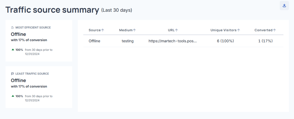
Traffic sources summary is a detailed view of respondent and conversion metrics (plus margin of error) for each traffic source in the campaign. This table will also show green and red arrows which represent the percentage that the respondents and/or conversion rates have increased or decreased compared to the previous equivalent time period. For example, if the summary is displaying data for “last 30 days,” these rates will be compared to rates 30 days prior to the “last 30 days.”